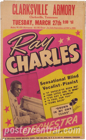
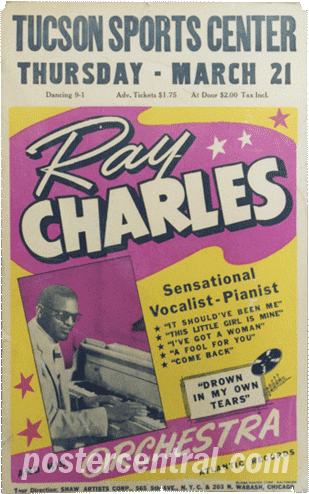
Ray Charles Posters
Can you spot the difference between these two Ray Charles concert posters, from 1956 (left) and 1957? (Other than the differing venue information at the top, of course, and the slightly different hues.)
Aficionados consider this to be the best-looking style of Ray Charles concert poster ever made, and he used posters continuously throughout his entire career. It doesn’t hurt that this is from Ray’s R&B prime – the mid-’50s, when he was an Atlantic Records powerhouse.
Spot the difference yet? It’s just one word – but what an important one. Apparently Ray’s booking agency or manager didn’t mind describing him as “blind” up to 1956, but it was dropped as a designation after that, never to appear on a Ray Charles window card again.